Google is slowly but steadily revamping all its apps to suit the new Material Theme. In the recent development, the search engine giant is working a new look and feel on Google Drive for iOS and Android, making it easier to communicate and collaborate across files in Drive on mobile devices. Google Drive for the web got the feature back in May last year.

According to the company, this Material redesign is part of a larger effort to bring the look and feel of our G Suite apps together as a whole, with ease-of-use in mind.
The revamped Google Drive is already started rolling out for iOS users starting on March 12, 2019, and Android users will get it starting on March 18, 2019.
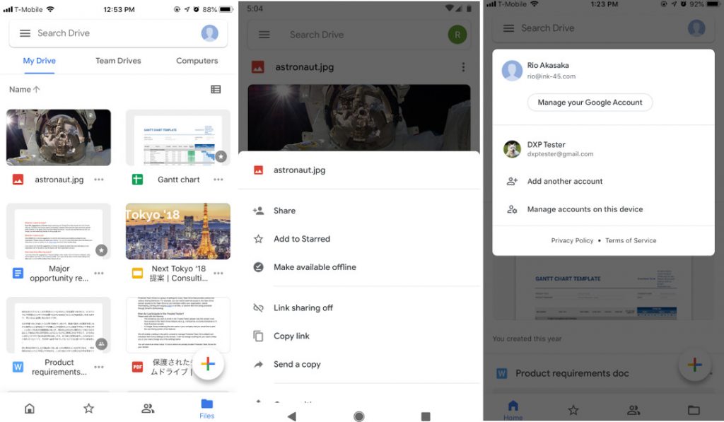
New Home tab and bottom navigation
Similar to Drive on the web, the Home tab will surface the files that are most important to you, based on things like:
- The last time you accessed or edited a file
- Who specific files are frequently shared with
- What files are used at specific times of day.
A more intuitive bottom navigation bar that features options to switch between Home, Starred, files shared with you (Shared), and all files (Files), allowing for quicker access to your most important items.
Expanded search bar
The search bar is now more accessible across the application, including from the Team Drives page.
My Drive, Team Drives and Computers in Files view
Team Drives will be now be displayed as a tab next to My Drive in the Files view. Users will also see a Computers tab if they have backed up content from a local machine to their account.
New account switching experience
The feature to switch accounts is moving from the left navigation menu to an icon in the top right.
Revised actions menu
A revised actions menu attached to every file and folder emphasises the most frequently used actions at the top. Toggles for starred and offline are now changed to buttons.