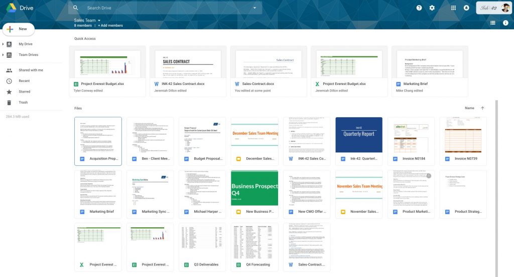
Last month Google rolled out revamped Gmail with refreshing new design and interface and now the company has announced an update to Google Drive on the web. This includes a range of visual tweaks to align with Google’s latest material design principles. The company is touting the new interface as responsive and offer an efficient experience for Drive users.
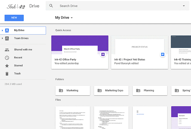
Other notable changes include the logo in the top left has been changed to the Google Drive logo and all the custom company logos are now moved to the top right. The settings icon has now been moved in line with the search bar and the Help Center icon has been moved in line with the search bar. The page background is now white, not gray and the header font has also been changed.
The new interface does not change any functionality and will work exactly how it did before. The redesigned GDrive will be available for everyone in the next two weeks.