Hello and welcome everyone to the Nokia N8 Review Week here on Fone Arena! Each day of this week, one of our team members will cover one area of Nokia’s imaging flagship with all the do’s and dont’s. This should make for an exciting week and we’re all looking forward to that! Today is Wednesday, our names are Rita El Khoury and Sloan Bowman, and we have joined forces to tell you about the Nokia N8 software and what you can expect of it. Since the software/UI is a very objective and personal matter, we thought we would give you two real-world opinions of it, sometimes we’ll agree, other times we’ll have radically opposing impressions. Enjoy reading along and if you have any questions on that matter, leave a comment!
After tackling the Hardware and Camera in the previous days, two aspects where the Nokia N8 excels by anyone’s standards, we come to the most controversial aspect of the N8, the software or Symbian^3 and its UI. Symbian^3 is the first major software leap since Nokia brought S60 5th Edition on the Nokia 5800 XpressMusic. Upon introduction, Symbian^3 was described as an evolutional not revolutional progression, meant to fix all the major issues that plagued Symbian’s first iteration with a touchscreen UI, and which were most heartfelt on the Nokia N97.
First Boot
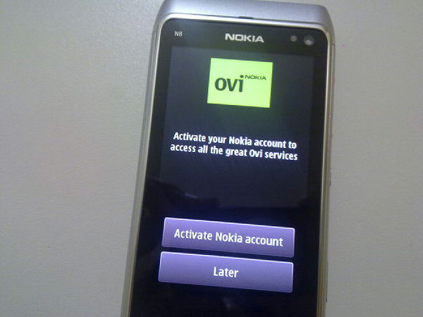
Rita says – The first boot experience on a Nokia is never spectacular yet always functional. You can just pick it up and go if you so wish. My most positive impression of the first boot on the N8 was the fact that I was asked to activate my Nokia/Ovi account instantly. It isn’t much, but it’s a good page to be stolen from the Android book, yet its usefulness is quite limited as of now. It will integrate with Ovi Sync and Ovi Maps, but that’s pretty much it. It won’t sign you into the Ovi Store, it won’t even set up a Nokia Messaging inbox with that Ovi Mail sign in.
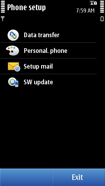
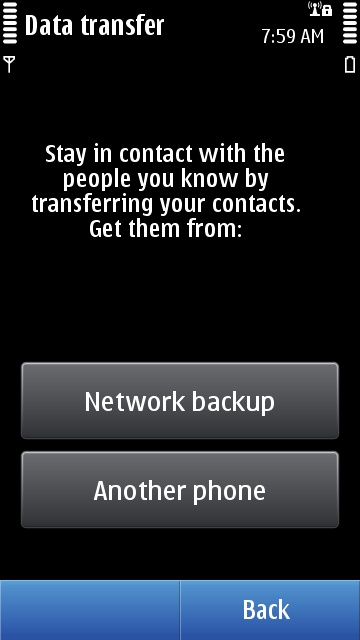
The Device Setup wizard kicks in after you sign in to Ovi. This wizard, first introduced with the Nokia N86, makes it easier to get going in 4 steps. Data Transfer will let you synchronize your Contacts, Calendar, Notes and more with a previous phone or from Ovi via Ovi Sync. Phone Personalization asks you to set a Bluetooth name, the ringing tones, theme and wallpaper. Setup Email lets you set up your inboxes, but they won’t support your previously created Nokia Messaging account, so yes, you will have to set up every inbox again separately. Software Update checks whether there is a new firmware version and installs it which is great to make sure you’re running the latest and greatest.
The first boot experience might be miles ahead of Apple’s iOS, with no computer connection required, but it is miles beyond Android in terms of getting to work instantly. Ovi is still not fully integrated into Symbian^3 and this shows in how the N8 handles synchronization with your Ovi account.
Sloan says – Powering up a Nokia device for the first time is always an enlightening experience. This can be portrayed in two ways. First being the device comes to life with the familiar Nokia chime leaving you with a feeling of enlightenment. Second being that literally the entire room is filled with white light as the extremely bright screen powers up, blinding anyone in its wake. However you choose to see it, when you power up a Nokia there is no doubt what device is in your hands.
Over the years Nokia has learned how important initial setup and migration from existing phones has become for consumers. The N8 provides a simple setup that can have you up and running quickly. If you are migrating from an existing phone you can use the Data transfer wizard which allows you to sync your Contacts, Calendar, Notes with Ovi services ( if you are an existing Nokia/Ovi user) or you may choose to import from an existing phone which works well with my experience.
The benefit Symbian has over other popular platforms is that out of the box you can have a working phone with or without a cloud service for syncing or a computer to activate the device. As devices become more service dependant they tend to forget that not everybody wants to use these features. Symbian gives you the choice to simply use the device as a phone, which after all, is the intended purpose.
Overall feel
Rita says – I will only say this once. Symbian^3 makes S60 5th Edition and Symbian^1 feel retarded. A ton of things have been fixed, improved, and I can’t see myself moving back to a previous Symbian touchscreen phone. If you’re a Symbian veteran, this is a major leap forward; if you got used to iOS and Android, Symbian^3 is a major leap backward. It’s a question of perspective.
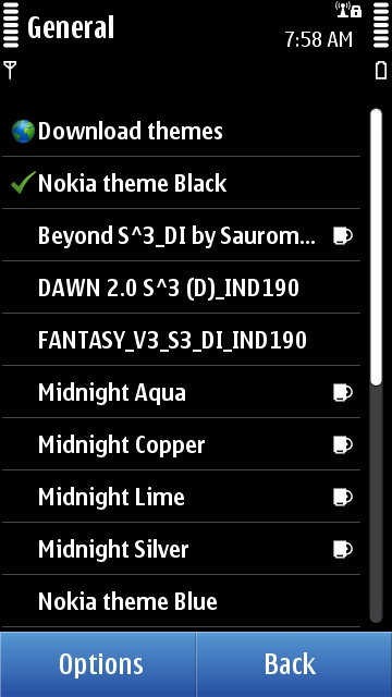
One of the major benefits of Symbian, since its inception, is that it’s a fully themable UI. The N8 doesn’t break that rule, and when you get tired of a certain look and feel, you can easily download and apply a new theme, which will change the homescreen background, menu, icons, progress bars, keyboard, and more.
Sloan says – I will preface this with if you are expecting it to feel like an Android or iPhone device you are starting on the wrong foot. Symbian in its current state is what I like to call in hold-over mode. This release bridges the gap between what is to come and what never should have been. Now that we have that out of the way let’s discuss how the latest edition of Symbian feels on the Nokia N8. The majority of people that purchased the N8 are or were previous Nokia users. From that aspect, the experience has been vastly improved. The phone feels quicker and adds several visually pleasing upgrades that make it feel new. Under the visual enhancements a lot of work was done and should not be ignored.
The major issue is that some of the things that were a problem 5 years ago still remain problems at this point. The user interface is inconstant and at times confusing. I will give two examples and leave it at that. When entering any text the keyboard fills the entire screen taking you out of the context of what you are working on. This alone is a problem but the real problem is some input fields allow predictive input and others don’t. There is no indication as to why and this makes for a very frustrated user. Second there are several cases in which selection toggles behave differently. In one case you touch to change the option in others you touch the menu and select change option. Visually there is no way to indicate which is required. How can you expect users to get comfortable using a system that doesn’t have a consistent experience? The experience has been improved but is nowhere close to being where it needs to be to escape criticism.
Screen & Keyboard
Rita says – Let’s get this out of the way. The N8’s touch implementation is terrible. By default, it takes a fraction of a second longer to register a touch on the N8’s screen compared to other touchscreen devices (iOS, Android and others). It might not sound like much, but for many people, this will seem as if the N8 isn’t responsive as they will click, click, click, with nothing happening, then out of frustration cliiiiiick a long one and kaboom it happens. Several of my friends were dumbfounded by the N8 thinking the screen was locked when all it took was a slightly longer press for every action.
Multitouch is implemented in photo browsing, in the Camera (to switch between the 12MP 4:3 ratio image and the 9MP widescreen image), in the Web browser and in Email. It is not available on Ovi Maps out of the box, as you will have to update to the latest beta from BetaLabs which brings multitouch support. But what’s the most mind boggling, is that multitouch isn’t implemented in the one area where you would need it badly and the most frequently: the keyboard.
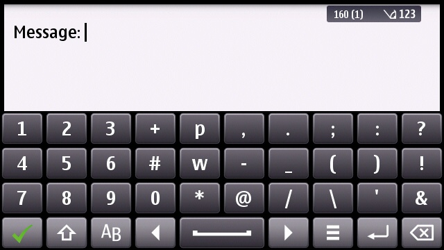
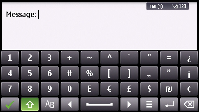
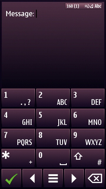
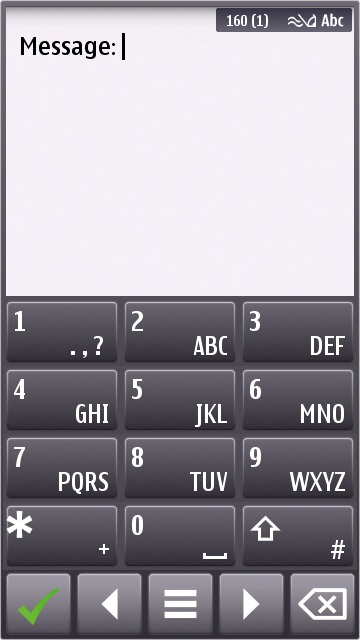
The keyboard lets you insert almost all symbols without going to the Insert Symbol menu.
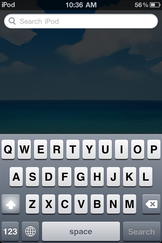
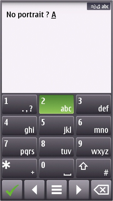
When you first start typing on the N8, you will have to take a deep breath and press each letter, lift your finger, hope that it didn’t register the click wrong which it does half the time, exhale, and repeat. Why hurry, really? Relax. I think it’s the Finnish medication for stress relief, except it’s really stressful. Well, that is until you find everything else that is wrong with the on-screen keyboards. Yes, you will curse between your teeth many many times, like when you notice it makes a hundred accuracy errors a minute, or when you see that the space bar is so small you hit the arrows next to it by mistake most of the time, messing up your whole text, or when you find that predictive text isn’t there, or when you discover that predictive text IS there but isn’t enabled by default (really?), or when you try typing in portrait and get hit by this horrible T9 keyboard. I hate that one, NOT because it’s not a portrait QWERTY, but because the arrows and ok keys are located below the 12 keys. Every single phone, Nokia or other brand, since the dawn of time, has had its selection keys and arrows ABOVE the keypad, not below it, why switch now? Counter intuitive at best.
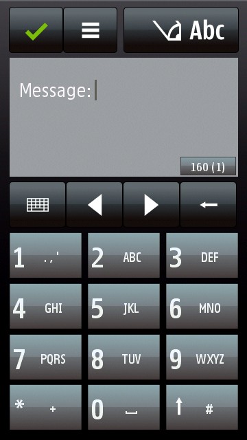
Portrait T9 on the N8 vs the 5800 XpressMusic. Notice where the selection keys and arrows are?
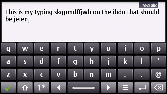
And don’t even get me started on the “smart” keyboard when you’re searching for contacts. After you type the first letter, you have to wait for it to register that and show you an updated view of the keyboard with only the possible following letters. Letter places will shift, it takes time and honestly it makes things much harder. Instead, if one full qwerty was shown, with irrelevant letters dimming out (not removed) and remaining letters lighting up (not reordered), it would have been much better.
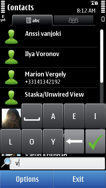
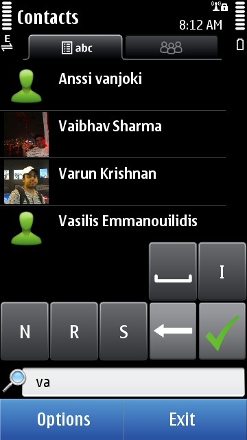
Notice how this “smart” keyboard shifts the key placements, there’s no typing blind here, definitely!
Rita’s opinion on why a lack of portrait qwerty was a good decision – Ok, let’s clarify this. Nokia uses a 640×360 screen, meaning the length/width ratio is 1.77. In comparison, the iPhone has a 1.5 length/width ratio and most android devices have a 1.66. What does this mean? That Nokia’s screens are less wide than the iPhone, even on the same 3.5” on paper, and than Android handsets (the latter somewhat compensate vs the iPhone by having 3.7” and 4” screens). Being less wide, portrait qwerty keyboards would be extremely cramped on the N8, and add to that the real terrible accuracy that even plagues the landscape qwerty, and it will be a horrible experience. But (un)luckily, everyone kept harassing Nokia for a portrait qwerty, not understanding the physical difficulty of implementing it, and Nokia has caved, which they shouldn’t have. Future N8 firmwares will add the portrait qwerty. Enjoy it, people. It will be cramped, definitely, though accuracy might be improved.
Physical proportions of the portrait QWERTY keyboard on the N8 (thanks to an implementation on the Twitter client, Gravity) and on an iPhone. Notice how more cramped, in width, the N8 keyboard is?
Sloan says – The screen being the only method to interact with Symbian on the N8 means that a lot of time and research needs to be put into making sure the experience is a good one. Users expect to touch the screen and be presented with results immediately. Due to the long overdue addition of the nHD (640 x 360) capacitive display on the N8, the screen is close to achieving just that. Moving around the phone is snappy and in most cases touches are registered and processed quickly. There are times that pressing a menu item or button will be delayed which can lead to a bad experience, possibly causing some to become aggravated and give up. In most cases, this will happen in third party applications and even more specifically WRT (Web Runtime) applications. WRT applications tend to be very slow to respond to touch giving the perception that the screen isn’t working. Don’t believe me? Download the WordPress app which is a full QT application and see how quickly you can move around and how accurate the touch input is. Next try the built in Social network application and tell me you don’t see the difference. This proves to me that the hardware is in place but Symbian hasn’t worked out the performance problems with some of the applications that run on it.
The screen is one of the best Nokia has ever released however there are still some issues that need to be worked out. More time needs to be spent making sure sure the touch experience is a not a good one but a great one. The N8 is nice and works well but when compared to other modern touch screen phones, doesn’t feel as fluid. If you have to think to yourself “did I miss the button?” at anytime during your usage it isn’t good enough.
For many, the on-screen keyboard is the deciding factor for any touch screen phone. If you cannot type with ease a touch-only smartphone might as well be a nice looking paper weight. When it comes to the Symbian keyboard implementation, there really is nothing more I can say other than it isn’t good. In comparison to the previous Nokia 5800 XM, it is much improved due to the capacitive display but not because of any design changes.
In portrait mode you are presented with the T9 keyboard which is great for one handed typing of short messages but horrible for things like filling out forms on web pages. If you are thinking just bring up the portrait qwerty like on the 5800 XM, I will answer with I would, if it existed. To my surprise there was no portrait qwerty supplied on the initial firmware. To some this may not be a big deal, for me it was a shocker. Some may argue that the majority of Symbian users are comfortable with T9 thus it makes sense. This may be true however not even having a choice to use a portrait qwerty was a mistake in my eyes.
The landscape keyboard has been updated and now provides additional keys such as the left and right directional keys to the left and right of the space bar. These are a nice addition but tend to get in the way when typing. Beyond the changed look and key placement, I found it very difficult to type accurately even with predictive input turned on. Several improvements have been made to the Symbian operating system but the keyboard is just not one of them. For me, this is the worst aspect of the entire Symbian experience. They need to take a step back and create a much more user friendly design.
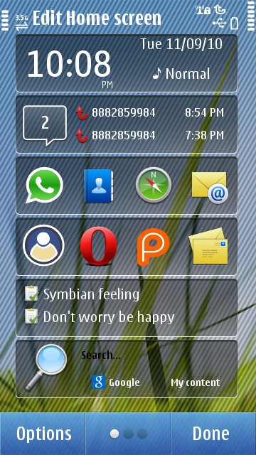
Homescreen
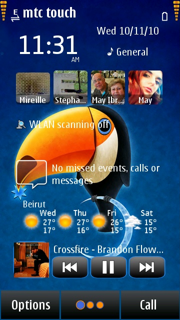
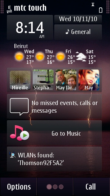
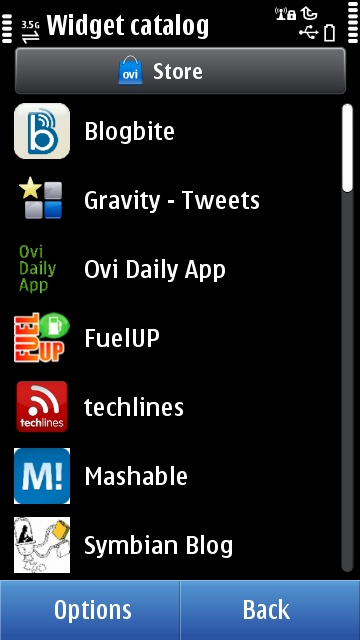
Rita says – I will have to confess to a love-hate relationship with this Symbian^3 homescreen. I’ve wanted a personalized homescreen on Symbian since 2006 and when the N97 brought it, I was ecstatic. I am even very happy that the N8 brings 3 homescreens, giving me a total of 18 possible widgets. I am an organization freak so I find myself quite at home with the similarly-shaped, linear widgets on it as opposed to the whirlwind of entropy that are the Maemo widgets for example. Yet most of these widgets are quite … meh. Believe it or not, the best one is the default Date/Time widget, that lets you access the Clock, Calendar and switch Profiles easily. There’s also a side-scrollable 20 Contacts widget and you can have multiple Shortcuts widgets. A few other options are Music Player, WiFi, FM Transmitter (only opens the app), Email (only one inbox and 2 emails per widget), Search (slow as molasses), Social (if you use it), Calendar (limited to 3 events), some news and WebTV widgets. That sums it up.
Personally, I use Shortcuts the most, allowing me to have access to almost every app from my homescreen. I do realize I’m iPhone’ing the N8 to some extent, but this is the best I can do to make these 3 homescreens functional. There is still a severe lack of useful widgets out of the box: no connectivity widget that lets you toggle bluetooth, WiFi, Data or screen rotation (luckily options are showing up), no Birthdays widget, no extensive Calendar widget (if you want one, get ComingNext), no weather widget (SPB Weather does a good job). The advantage of Symbian is that there will always be third-party developers who will step up to improve the usability glitches, so the overall homescreen experience is majorly improved when you figure out what you need and try finding it on the Ovi Store or online.
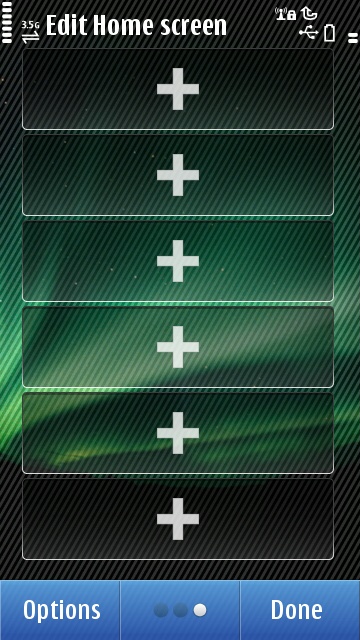
You can organize these widgets as you wish, but don’t try to drag one to another screen, it won’t happen. This is horrible for Shortcuts and Email widgets, as you will have to re-set them upon removing from a screen and re-inserting on another one. You can also send these widgets to offline mode to save data and battery.
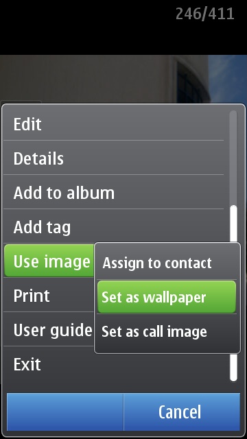
Wallpaper management, however, is messed up, to an extensive degree. See, you can set a different wallpaper on each of the 3 homescreens, but you have to do it separately, there is no way to pick a wallpaper and have it applied to all 3, or using a panoramic wallpaper across all 3 homescreens. Even if you try setting up a wallpaper from the Options menu while browsing a photo, it will only apply to the one homescreen you have open in the background, ie “Use Cautiously”.
A final word – if you want the N8 but hate the Symbian homescreen, do yourself a favor and get SPB Mobile Shell.
Sloan says – Symbian is unique in that it allows you to stack up to 6 widgets across 3 usable homescreens. The idea being you can put anything you need to see or use right at your finger tips. Adding and removing widgets to the homescreen is easily achieved by pressing on the screen and holding for roughly 3 seconds. From here, you click an empty slot and a widget catalog is presented with your selection of available widgets. If you want to remove an existing widget touch and hold and you will be presented with the option to remove. To move a widget, you press and hold followed by dragging it to the location on the screen that you want it located, then release. As easy as that sounds, there are some caveats that you should be made aware of. As of this release you cannot move a widget from one homescreen to another by dragging side to side. For me this wasn’t a big deal, but for a better experience this should be added at a later date.
Size does matter when it comes to content and the widgets on the Symbian homescreen aren’t big enough to be useful in many cases. What good is a Calendar widget that only shows two items or an email widget that displays 2 email subjects? Why not allow the user to decide how big or small they want their widgets to be and for that matter where to place them on the screen. In its current design, widgets are glorified shortcuts to applications with a tease of information to get you there. Symbian has always been about being able to customize the experience. The current homescreen has too many guidelines and rules limiting what can be done with it. Drop the rules and remove the boundaries and let us make it our own.
Multitasking
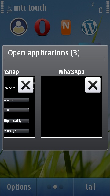
Rita says – With Symbian^3, a new multitasking UI is introduced giving you a “live” view of your apps. I put live in quotes because often times, you’ll find yourself with just the application icon, a black preview, or in best cases, it will only show you a screenshot of what you last saw when you had the app open, not what is happening now, ie if you’re downloading something, you couldn’t track the progress through this. You can flick through all these open apps, click on one to switch to it, click on the X in the corner to close it, or long-click to have the option to close all running apps.
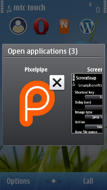
Multitasking visual: well just the icon in one case, and a black screen in the other.
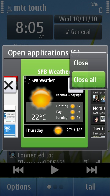
Symbian is definitely the only mass market OS I know that does Multitasking like it should be. iOS still relies on apps to implement it and true multitasking is only supported for a few actions, otherwise, it’s stop-then-continue. Android has a mess of a multitasking experience out of the box. Symbian does true multitasking and rocks at it, this fact no one can argue over.
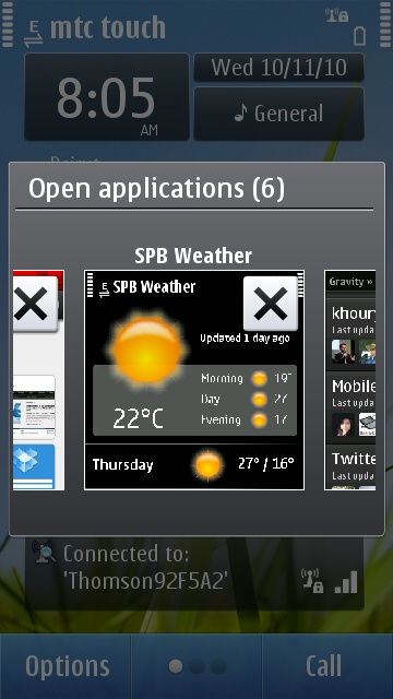
However, in my humble opinion, this new multitasking UI is hell to use. For average users, it will be cool because they will see what’s happening, but for power users, if you go anywhere above 4 open apps, it becomes more like trying to juggle 10 balls with one hand (read: impossible). You will click to the task switcher, scroll left, right, forget what you were looking for, stop for a moment, think again, scroll again, miss it, scroll back, then click. Try going to 7-8 open apps and the beautiful UI becomes an inefficient stressful UI. The choice to switch to a vertical list of open apps or small icons like on previous Symbian iterations would have been much more efficient for power users.
Sloan says – Multitasking is nothing new to Symbian having been built with the feature at the core of its system from the beginning. With the latest release, there are some changes that are of interest. The most noticeable being the newly designed task-manager. Instead of the bland pop up displaying application icons that users have been used to over the years, the task-manager is now front and center and displays a screen snap of each running application in an easily viewable and more importantly touchable design. They took an interesting approach to the card style layout by using an actual capture of the top portion of the application to use for the image in the task-manager. At first this doesn’t seem to make sense but if you think about it, had they included a full image re-sized to fit the constraints of the container you would not have been able to tell the difference between them visually. By capturing only the top portion of the application you can easily differentiate between the applications with a quick glance. Some may argue that the larger representation of the applications makes it more difficult to move between open applications and to an extent I agree. If you have 8+ apps open (yes you can easily do that on the N8), it can be trivial finding what you want quickly. On the other side of the argument however, is you have a nice viewable representation of your applications which are very easy to touch. For me it isn’t perfect but it works and is a welcome change.
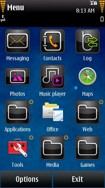
Menu and organization
Rita says – If you have used any previous Symbian phone, you will be at home with the N8’s menu. The look is improved compared to S60 5th Edition thanks to a 6×2 grid in landscape instead of the horrid 4×3 grid with the huge Options/Exit buttons on the right previously. Organization has been a bit improved also: now you can move folders in/out of other folders, you can long click on an app/folder to select a path to move it to. Also when you move an icon to another folder (parent or sub), you won’t be taken to that folder directly: this is a welcome addition when you’re doing some dusting around folders. A major drawback is that with the built-in theme, you still can’t tell folders from applications.
Sloan says – Three years ago, I would have said that Symbian has a wonderful folder structure and allows for the easiest customization out of the major platforms. Now I feel it is lagging behind. It still allows for the customization that made it great but like the homescreens, I feel that there are too many guidelines. You can customize until your heart is content and the options to do so are abundant but how you do it matters. I hate how iOS limits you to the number of applications you can put in folders but I love how easy it is to organize your apps on the otherwise cluttered screen. With Symbian, to organize your applications into folders, you select the menu and touch organize. You can organize each application by long pressing and choosing move to folder or dragging the folder or application icon into an existing folder. The problem for me is you have to be too precise in doing so. You must drag the icon from the bottom into the folder you want to drop it to otherwise you find yourself playing a nice game of rubix cube trying to figure out how to get the folder to go into the right order [Editor note: so true, best description I have read of this issue]. It shouldn’t require skill to organize. You can get around this by using the menu and move to folder but that is a bit tedious when you’re moving a lot around. For me it is good but I was hoping for a change this time around.
In conclusion
Rita says – In my opinion, Symbian^3 and its UI is what Symbian should have been on the Nokia 5800 XpressMusic when it shipped in November 2008. There is really no reason why we had to wait 2 years for these improvements to be implemented, when none of them is really revolutionary. Symbian^3 would have been amazing in November 2008, but in November 2010? It is OK. Just that. Some things work well, other things still suck, massively, like the keyboard, the touch implementation that Nokia still can’t seem to get right, the wallpaper setting, and other things are just average like the widgets, the menu or the multitasking UI.
But let’s face it, no one will buy the Nokia N8 for its UI, no one will say “I love the N8 UI” unless they were stuck with Motorola RAZR for the past decade. People will get the N8 for the 12MP Camera, the HD video recording with ambient sound, or the HDMI out and Dolby Surround support. The UI is just a plus you get and you have to live with. It all depends on whether you can live with it or not.
Sloan says – The Symbian UI is now in a state that it should have been back in 2008 when the first S60 touch screen phone was released. The changes are all very welcome but have taken entirely too long to be added. I would never go as far as saying the UI is unusable because honestly that is just not true. The truth is we have become spoiled by other much more innovative interfaces leaving the traditional Symbian UI feeling old and cumbersome. It provides all the needed tools to get the job done but needs to have some major changes if it wants to compete. When all is said and done, it comes down to what you are used to and what you can live with. If you are a Nokia/Symbian user, the N8 will be the best experience you have had to date. If you are trying it coming from Android, WebOS, or iPhone you will more than likely make snide comments to all of your friends about how old this feels and that is completely unusable. The thing that matters is that it is just as capable if you know how to use it.