Google has been changing the design of their services from quite some time now, experimenting with different layouts and interface design. Now Google has changed its mobile homepage to look somewhat like Google+. They are looking to have a unified design for all their services is what I think.
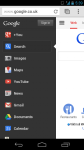
This new homepage design has just been rolled out and may not be visible yet in some countries. But the new homepage looks really good and less cluttered. It has a expand button on top which looks like the options button on Google Chrome browser which you can press to see and go to the various services by Google in a scroll able list format. This new extended interface also shows you your Google+ notifications. This new interface looks really neat. Let us know what you think about this design change in our comments section.