Google has updated Play Store with new features and refreshed look from the Material Design. The Play Store which is now updated to version 5.0.31 focuses on Google’s new design language and user experience ahead of its Android L rollout.
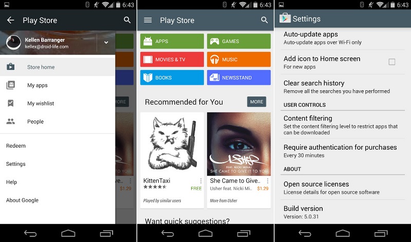
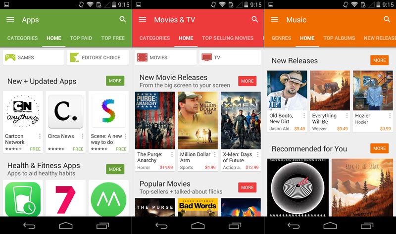
For starters, the Play Store icon has become more flat and the whole Play Store boasts of a more colorful, bold and bright color palette that is the essence of Google’s Material Design. The home page of the Play Store shows main categories like Apps, Movies, Games and Books in different bright colors.
In case of the app pages, the ‘What’s New’ section has been bumped at the top instead of staying at the bottom after the ‘Read More’ button for description of the changelog. The entire Play Store gets small animations that enhances the navigation experience. The Play Store was previously updated in July with Material Design UI which gave it a complete makeover.
The Google Play Store update will automatically roll out on your device and might take some time to reach as it is being rolled out in phases.
via:Android Police