Yesterday, at the Google I/O conference in San Francisco, design played a huge role in the company’s announcements to the public. After getting Android One out of the way, Android and Chrome chief Sundar Pichai invited Matias Duarte on stage. Being one of the highly creative minds behind the critically acclaimed WebOS interface, Matias made his mark on Android with Ice Cream Sandwich. Fondly called Android ICS, the update was and still is one of the biggest visual overhauls for Android, as a platform. “Holo” was the design language spear headed by Matias, who talked up design principles based on clean lines and flatter interface elements. It was the beginning of a more coherent interface for Android, but Google, as a company, was heading in a separate design direction.
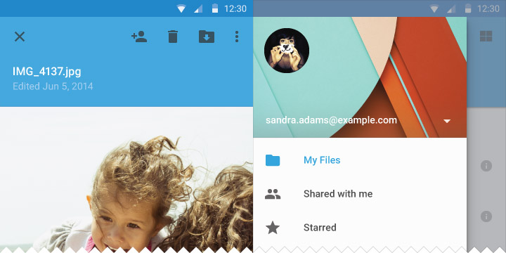
All Google products received a “Card” interface treatment, starting mainly with Google Now, which revolves around the same concept as its function. This started permeating other Google products too, including the company’s premiere social networking product Google+, its massively popular mail product and even YouTube. Eventually that trickled down to respective clients in different form factors like mobile, where, at a point, Android had to change itself to look more “Google” than it was, right now. And then Android 4.4 KitKat happened, with several minor changes to bring it in line with other Google products. The use of a cards interface was encouraged, with many third party developers taking a liking. Google’s iOS apps went “cards” style, sometimes even before Android, so a change was set in motion. But it still felt fragmented, as KitKat could not really cover each and every aspect of the operating system seeking a visual overhaul, so something had to be done to unite everything at Google. Enter material design.
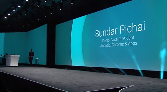
The I/O 2014 live keynote had speakers talking in front a massive screen that showed off all their names with a throbbing animation of an expanding circle, in really a cool colour palette. This was material design in action, way before Matias Duarte started detailing it with arguably over reaching statements and a generous use of adjectives. “Material Design” is the name that Google’s design team have given, for the company’s new design language. It will span across all the company’s products, right from Android on the phone to Android on TVs, and from Chrome on the phone to Chrome on your laptops and desktops. Everything that Google does, from here on, will be based on “Material Design”. So, what is material design?
If you want to go by the definition, Material Design is –
We challenged ourselves to create a visual language for our users that synthesizes the classic principles of good design with the innovation and possibility of technology and science. This is material design.
or
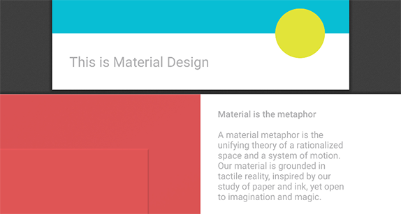
A material metaphor is the unifying theory of a rationalized space and a system of motion. Our material is grounded in tactile reality, inspired by our study of paper and ink, yet open to imagination and magic.
Well, we know it’s a bit hard to comprehend, we too were initially dumbfounded by it. So, the first one is all about creating a visual language (a set of rules and properties) that follows the good practices of design (like using whitespace, sticking to grids and so on) and takes advantage of effects realized through technology (like graphical effects of motion, shadow manipulation, light sources etc). The second one is almost the same, except it explains their inspiration behind the language, which is paper and ink, while the mention of tactile reality deals with them following real world properties of motion.
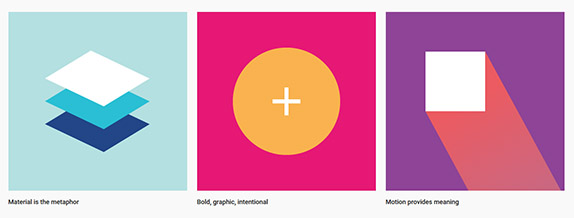
These are three basic design principles behind “Material Design”. We already saw that “Material is the metaphor”, but “bold, graphic, intentional” reveals more about their ideas behind the use of colour, typography and indicators to guide users to the right interface elements. Motion on the other hand deals with the introduction of real world-like animations, involving a lot of movement. These three pillars of “Material Design” define what developers needs to know, to make their apps coherent with the company’s products.
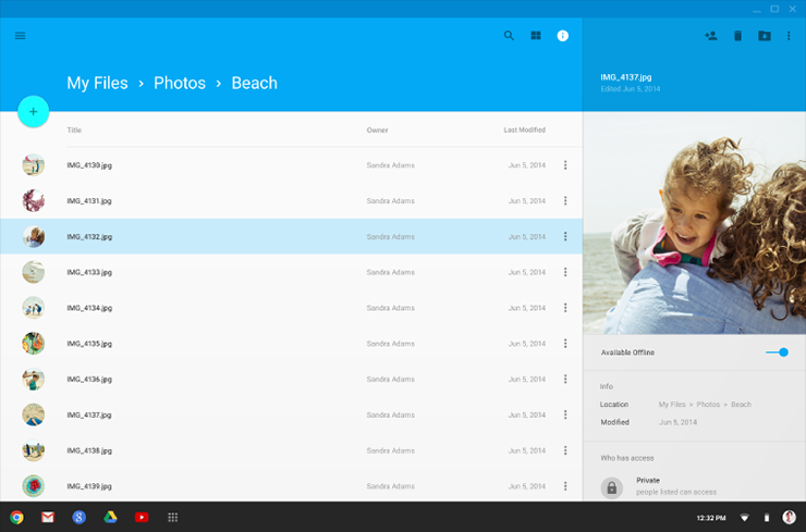
As mentioned earlier, Material Design takes Google’s “cards” interface ahead, leaving Holo behind, so that’s a pretty drastic change for the company’s flagship mobile product. Users will be looking at a new colour palette, a new interface with perspective shadows and of course, cards. This is the final nail in the coffin for all the design inconsistencies the Google of day before yesterday had. While it will take considerable time to roll out, Material Design will be playing the central role to Android’s yet-unnamed L update, which is scheduled to arrive for the Nexus 5 and other newer devices, as a developer preview.
This will help developers with updating their current apps to match the new design language, which already has a robust preview document that details all the changes and thinking behind “Material Design”. It’s a “living document”, Google says, as it promises to keep adding guidelines and good practices. This might also mean that the complete instructions are still a work in progress, which might also explain the delay in the L update this time.
Spanning across Android phones, tablets, Chromebooks and even Google’s web properties, “Material design” will change the Mountain View company forever, as it gears up to offer its customers the coherence they always needed.
Designers looking for more can go here