Ahead of I/O, Google accidentally shared a blog post about Material 3 Expressive, its upcoming design update for the Android operating system — 9to5Google reported it before it was taken down and archived by the Wayback Machine.
Material 3 Expressive
The update, described by Google as a “bold new direction for design” and its “most-researched update” yet, is officially called Material 3 Expressive, also known as M3 Expressive or simply expressive design.
Rooted in Research, Not Just Aesthetics
Material 3 Expressive emerged from a broader internal inquiry in 2022, when Google’s Material Design team questioned why apps were beginning to look too similar and uninspired. The company asked: “Why were all these apps looking so similar? So boring? Wasn’t there room to dial up the feeling?”
This led to a multi-year design and research process. A total of 46 research sessions were carried out, with input gathered from more than 18,000 people across various regions. These included:
- Eye tracking to observe where users focus
- Surveys and focus groups to assess emotional reactions
- Usability tests for speed and ease of use
- Experiments to gauge preferences and sentiment
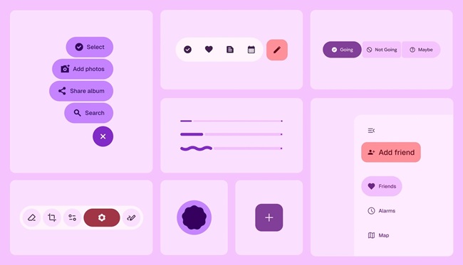
The goal was to build a design system that is both emotionally engaging and functionally intuitive. Google said the key elements of expressive design include color, shape, size, motion, and containment, all aimed at making interfaces more effective and emotionally resonant.
Making Key Actions More Visible
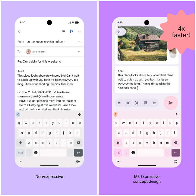
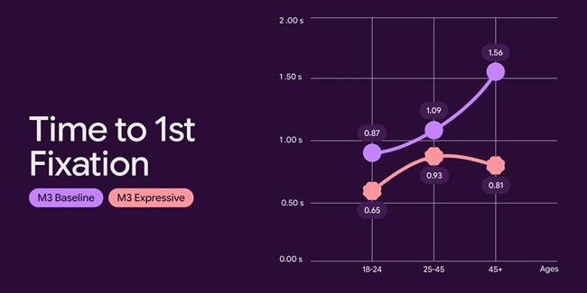
A major part of expressive design is to ensure users can quickly find and act on key interface elements. Google noted that expressive interfaces led users to spot main actions up to 4x faster, and reduced the time it took to tap important controls.
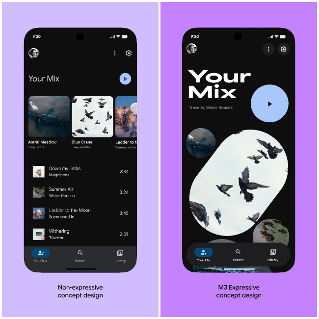
One concept, for example, shows a floating toolbar — a pill-shaped control bar at the bottom that doesn’t span the entire screen, leaving visible edges of the background. A similar design already appears in Google Chat.
In a redesigned email app example, the “Send” button was made larger, placed just above the keyboard, and given a secondary color to stand out. In contrast, the older design kept a smaller “Send” button in the top bar, next to other icons. Testing showed users were able to identify the expressive version much more quickly.
Concept Designs and Perception Metrics
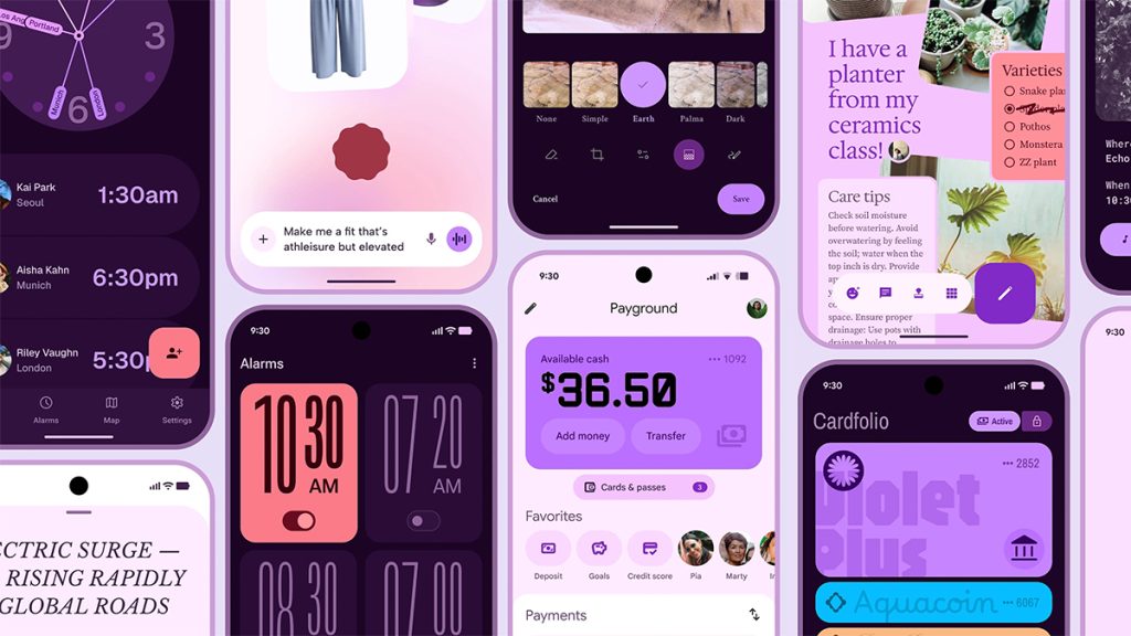
Other experimental designs include apps for clocks, photo editing, voice input, payments, and wallets. While none of these are final product versions, a Google Clock redesign was also leaked over the weekend.
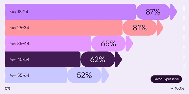
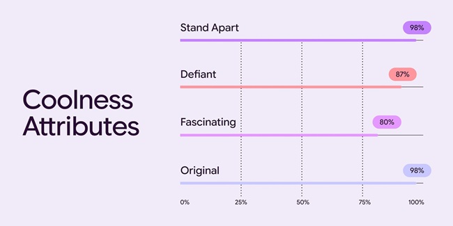
Google said user testing consistently showed that expressive designs were preferred across age groups over those based on Apple’s Human Interface Guidelines. Participants also viewed expressive design as more modern and culturally relevant:
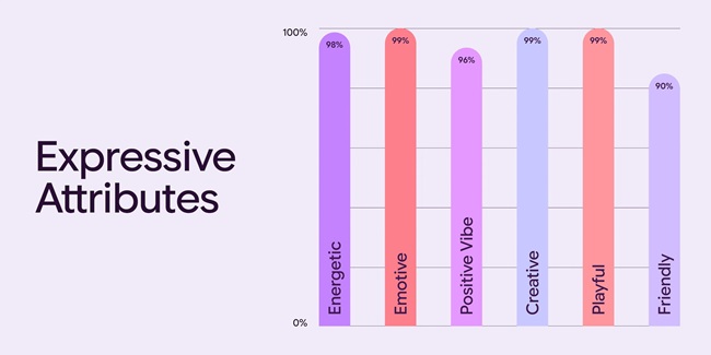
- Participants perceived a 32% rise in how culturally aware and trend-conscious a product appeared
- 34% increase in how modern the product felt
- 30% increase in perceptions of boldness and willingness to break convention
According to Google, expressive design contributed to a stronger sense of brand relevance and creativity.
Set for Launch at Google I/O 2025
While the blog post has been removed, Google is set to officially present Material 3 Expressive at I/O 2025 during a session titled “Build next-level UX with Material 3 Expressive.”
The company plans to show developers how to apply new emotional design patterns to improve usability and engagement. It will also share early design files and alpha code, enabling experimentation ahead of a broader public release.
The event will stream online, with registration open for keynotes and sessions. The conference is scheduled for May 20–21 at the Shoreline Amphitheater in Mountain View, California.