![]()
Google introduced new Material Design alongside the Lollipop OS back in 2014. The material design introduced flat, pastel color palettes, depth, soft lighting, and the design later is being unified to all Google products. Now on the occasion of its four-year anniversary, Google is said to be revamping the material design with new colors, iconography and more according to reports.
The new information obtained by XDA developers from the new commits in the Chromium Gerrit. The new Material Design said to bring touchscreen behavior and many subtle changes. Back in February, new commits on the Chromium Gerrit implemented “Material Design 2” UI in Chrome’s tabstrip; the draggable tabs containing webpage titles, favicons, and the “close tab” button above Chrome’s address bar. While the changes are not drastic, it changes to the appearance of Chrome’s tabs.
It brings tweaks to tabs content layout, especially to the titles, and alert indicators. It also decreases the tab touch width while increasing tab standard width. The commit further reveals the Material Design 2 color palettes for grey, red, and red-dark Chromium themes, and new colors for the standard Chrome toolbar and incognito toolbar. It is also learned that the new Material Design 2’s red is slightly darker than the current.
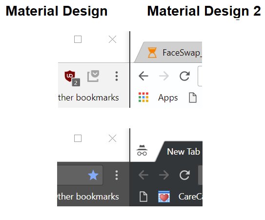
The new material design 2 complaint Chrome browser will have a much brighter toolbar than current builds. Finally, the commit adds a new IsTouchOptimizedMaterial() flag to the MaterialDesignController which might be a reference to the Material Design 2 elements optimized for touch. The commit is now being made private indicating that Google is currently working on it and if everything falls into place, we might get to see a new redesigned material U.I at Google I/O 2018 which is scheduled from May 8 to 10.