
In recent times, Google has been very keen on optimizing the Android interface for tablets due to the extensive growth of the tablet market. Continuing its work, YouTube Music is getting a few changes in the ‘album view’ section of the app. Few weeks back, the firm updated the UI of playlist section, making it better for tablet users.
This change was discovered by a Reddit user in YouTube Music v5.09.51 on the Samsung Tab A7. As per screenshots from him, the new UI change brings the album’s title and description next, followed by the album art, which is now bigger and has a blurry background. Previously, the artist, media type (album), and release year were at the very top of the portrait orientation.
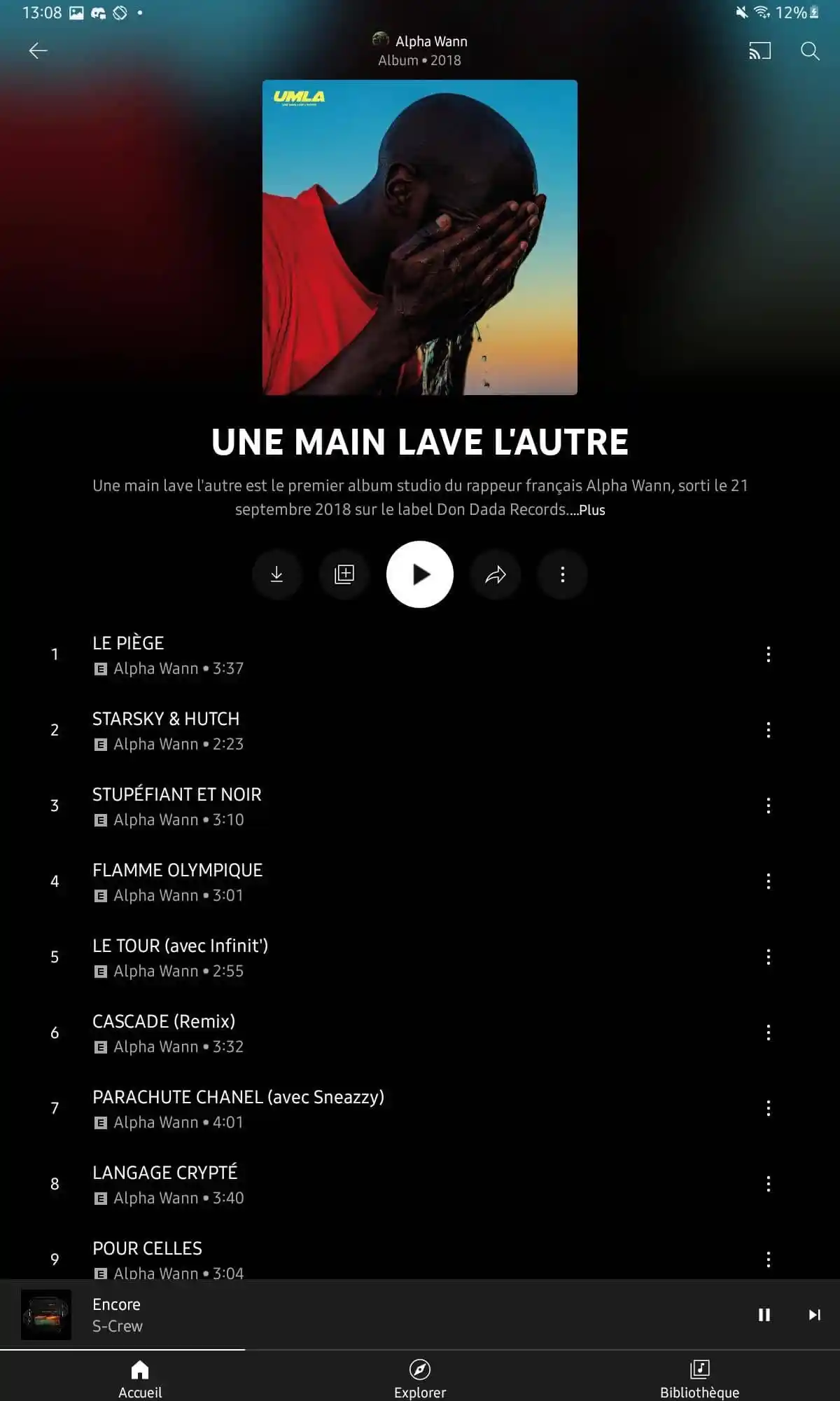
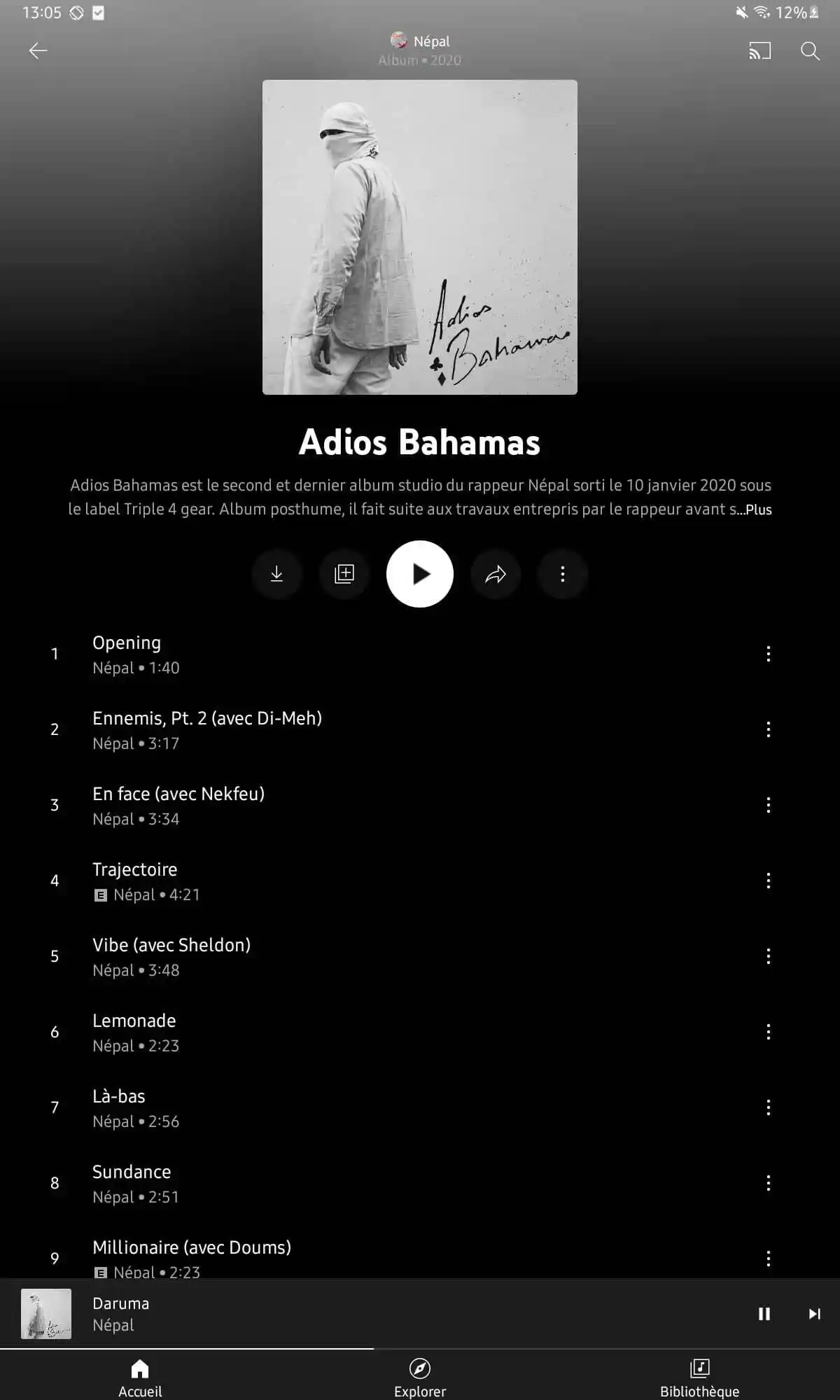
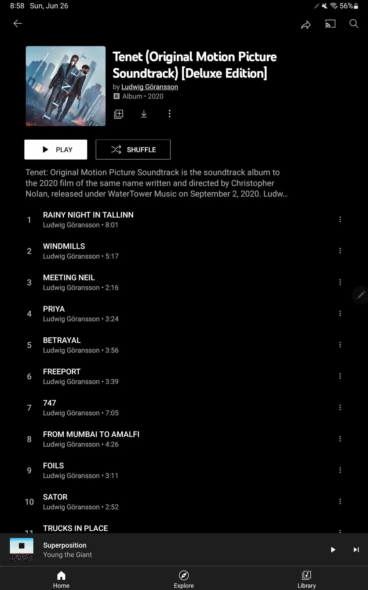
The new UI includes controls beneath the album title and description such as download, add to library, play, share, and an overflow menu. The list of tracks appears on the right on a (landscape) tablet, with all other information in the left column. When you scroll down, there should be a floating action button in the bottom-right corner for shuffling.
Do note that this revamp does not currently apply to imported music that you’ve uploaded. The rollout is gradual across tablets, and it is said that the new UI change will also appear on smartphones. It’ll be interesting to see how the new UI changes appear on the mobile screens.